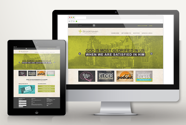
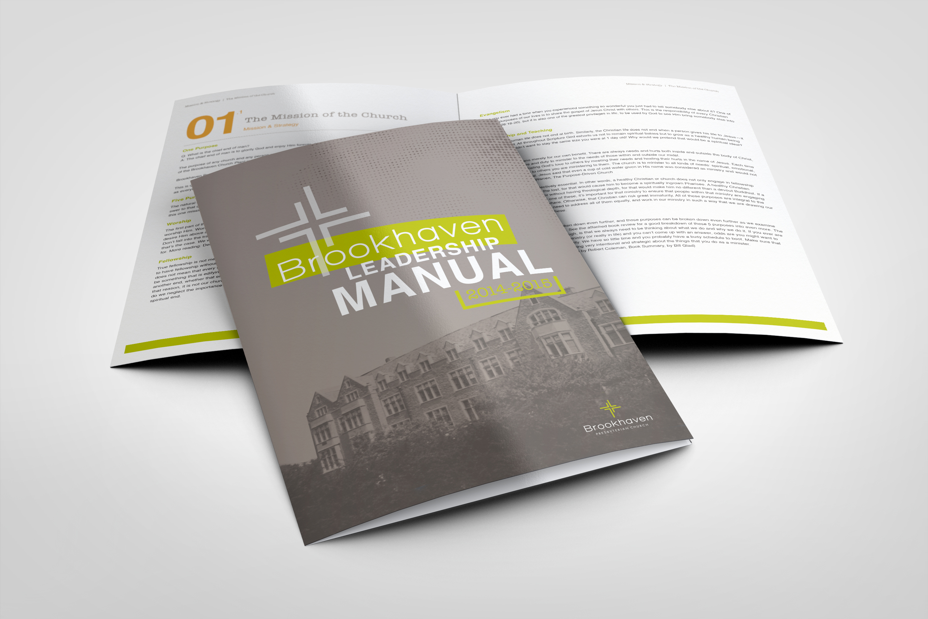
Brookhaven Presbyterian Church is located in a young, growing urban community near Atlanta. This logo’s mark focuses on the “Relational Mission” value of Brookhaven Pres. The cross is formed by arrows varying in length. These lines represent individual relationships with people and the unique ways people are led to the cross. A modern font balances the traditional Christian name.
The collateral speaks to the audience of 20-30 year olds in the community who find value in the truth of historical Christianity but live in a trendy, cutting-edge urban area. Distressed imagery of historical sights and traditional ideas also ties the two aspects of the group together. www.brookhavenpres.com


